SharePoint Web-Elemente: Fabric React und Fabric Core
Unter SharePoint empfiehlt es sich, dass man für Microsoft Office 365 und SharePoint übliche Aussehen über vordefinierte Komponenten verwendet.
Mit Fabric React werden Frontend Elemente eingebaut wie Listen, Buttons, HTML-Elemente, Text-Boxen..
Mit Fabric Core werden über CSS Farben, Icons und Fonts eingebaut.
Die SharePoint Fabric UI Elemente findet man unter:
https://developer.microsoft.com/en-us/fabric#/get-started/web
HTML, CSS, Controls, WebParts
hier eine kleine Liste der Web-Elemente für SharePoint
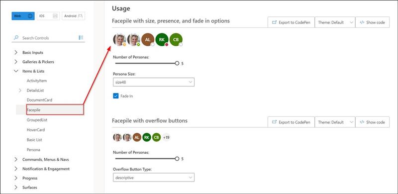
FacePile
The Facepile shows a list of faces or initials in a horizontal lockup. Each circle represents a person
https://developer.microsoft.com/en-us/fabric#/controls/web/facepile
Facepile with size, presence, and fade in options
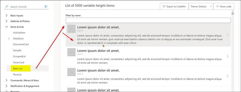
Basic List
List of 5000 variable height items
|
public render(): JSX.Element { const { items = [] } = this.state; const resultCountText = items.length === this._originalItems.length ? '' : ` (${items.length} of ${this._originalItems.length} shown)`;
return ( <FocusZone direction={FocusZoneDirection.vertical}> <TextField label={'Filter by name' + resultCountText} onChange={this._onFilterChanged} /> <List items={items} onRenderCell={this._onRenderCell} /> </FocusZone> ); }
|
Zu beachten ist hier: dass das Filter-Feld bei der Eingabe dynamisch filtert
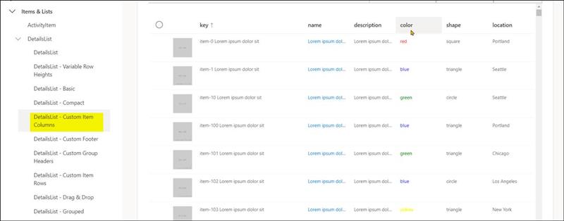
DetailsList
https://developer.microsoft.com/en-us/fabric#/controls/web/detailslist/customitemcolumns
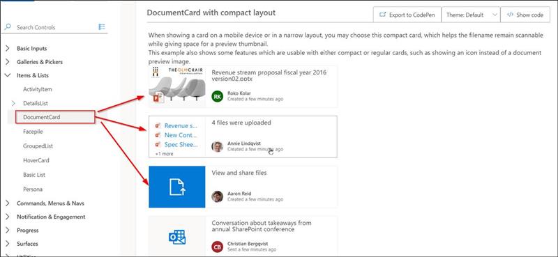
DocumentCard
Mit der DocumentCard kann man eine Datei mit einem Preview Icon darstellen als Div-Element.
A DocumentCard is a card representation of a file. This is usually richer than just seeing the file in a grid view, as the card can contain additional metadata or actions.
https://developer.microsoft.com/en-us/fabric#/controls/web/documentcard
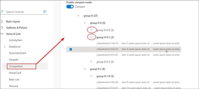
GroupedList
Liste mit Gruppierungs-Headern, welche sich erweitern und reduzieren lassen.
Allows you to render a set of items as multiple lists with various grouping properties.
https://developer.microsoft.com/en-us/fabric#/controls/web/groupedlist
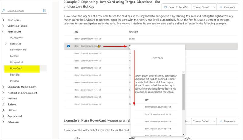
HoverCard
Mit der HoverCard wird eine Liste dargestellt, bei welcher über einer Zeile eine Karte als Hover-Element geladen wird, welche das Element im Detail als Vorschau beinhalten kann.
Expanding HoverCard using Target, DirectionalHint and custom HotKey
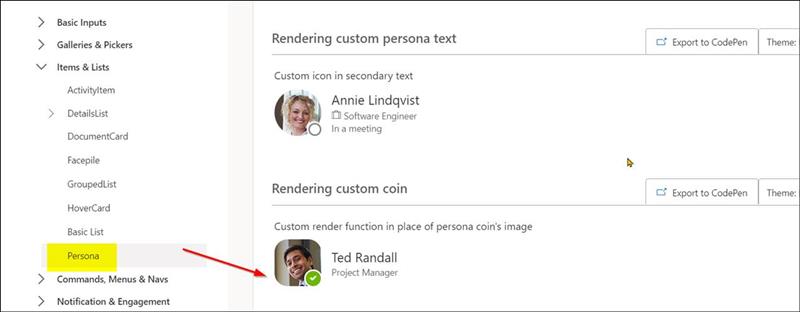
Persona
Personas are used for rendering an individual's avatar and presence. They are used within the PeoplePicker components.
Rendering custom coin
|
<Persona {...examplePersona} size={PersonaSize.size72} presence={PersonaPresence.online} onRenderCoin={_onRenderCoin} imageAlt="Ted Randall, status is available at 4 PM" imageUrl={TestImages.personaMale} coinSize={72} />
|


 Users by Links
 Follow-Follower
 Log in
 Register


 CodeDodu.de


